
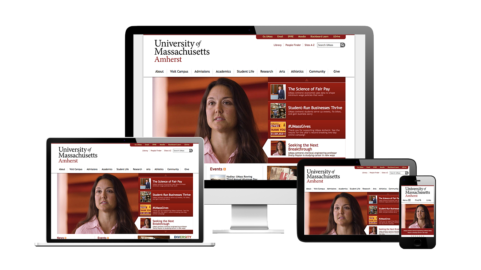
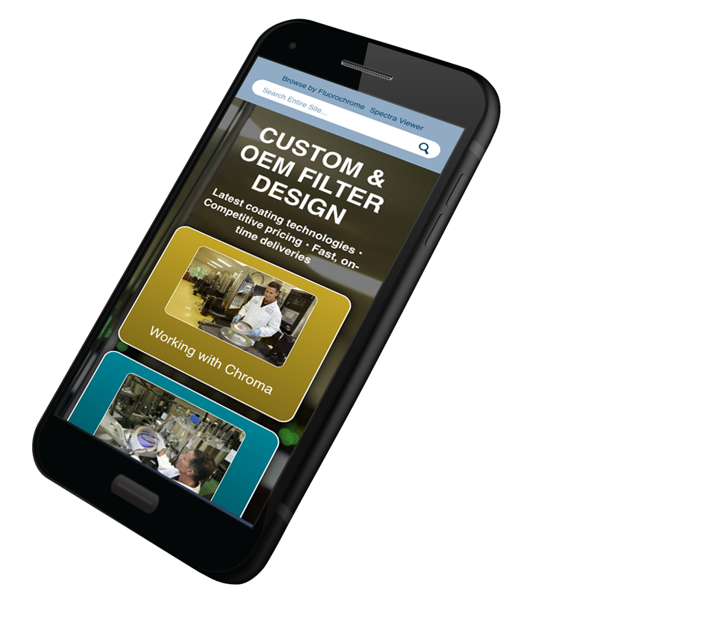
Mobile-first Web Design
Make your site work on any device
Responsive mobile-first websites built for all devices and orientations using industry-standard best practices
A great mobile experience is no longer an option in today's mobile-first world
"Google says 61% of users are unlikely to return to a mobile site they had trouble accessing and 40% visit a competitor’s site instead."
(MicKinsey & Company)
Whether we’re at our desk, on a train, or waiting in line at the grocery store, we expect to be able to look for and find the information we want...fast and without any hassle, and we have zero patience or tolerance for any business that isn’t able to deliver.
We’ll bounce to a different site faster than a rocket full of monkeys!
This is important for your business given that every time a customer wants to know, go, do, try or buy anything they typically start with a google search on a mobile phone or tablet.
Google recently announced that because most searches are now done on mobile devices that they've started to rank search results exclusively on their ability to provide a great mobile-first website. In other words no matter what device your customers are using, Google shows them results based on their mobile index. If your business isn't mobile-first you might not show up in those searches.
Give your business a competitive edge with responsive mobile-first web design. Build a site that people find enjoyable, easy to use and one that Google loves, helping you earn more customers and grow your business.
Design and Develop Your Mobile-First Website
Responsive Web Design
We build all of our websites using google recommended responsive web design. With responsive web design, each of your web page layout and content change depending on what device and screen size each person is using. This makes sure your site looks great no matter how its being viewed and it does it all without needing to create a separate mobile-version of your website.
Mobile-first SEO
We can help optimize your website to make sure it ranks in Googles mobile-first index. We'll use Google recommended user experience best practices and techniques to help make sure your providing your users with a great web experience, and because of that your mobile-first index rankings increase. We'll shoot for a 90 or better score on page speed insights, we'll optimize for readability and easy of navigation, put schema structured data in place and much more.
Advantages of a mobile-first website
Great User Experience
You want your users to have a great experience and be able to find what they need on your site when they need it whatever device they are on
Increased Search Rankings
You want your site to rank higher in search engines and understand that a site optimized for mobile use is part of the SEO ranking factor
Brand Affinity
Customers are more likely to repeat purchase if they have an excellent user experience, making it quick, easy and enjoyable for them to get need when they need it.
Better Engagement
You want to keep you users engaged with the content on your site where ever they are
Competitive Edge
Users get frustrated if they can't easily access or view content and are likely to go to your competitors site to get what they are looking for instead
Reach More People
More than half of all searches begin on a mobile phone and you want to ensure your content is fast and easy to access on those devices
Higher Traffic
You want to increase traffic to your site and know that more people will find and visit your content if its designed and optimized for all devices
Consistent Touch Points
You want to ensure your business has a consistent look no matter how visitors are coming to your site
Local Advantages
You want more calls or traffic to your physical locations and know that people who search for a local business on a mobile phone call or visit the store with 24 hours
Why let us help build your mobile-first website
1
You want to make sure your site offers a great user experience
2
You want to make sure your site is highly performant
3
You don't have the time to learn the design and technical skills required
4
You want to make sure your site is optimized for speed
5
You want to make sure your site uses modern up-to-date industry standard best practices
6
You want to make sure your site is optimized for accessibility
Most importantly, you have a business to run!
"There are 27.8 billion more queries performed on mobile than desktop."
(Google)
Sure, but my customers still only use desktop
Perhaps that's true, some industries particularly B2B, may not be predominantly mobile users yet, but there's a good chance they will be soon. In fact, 58% of all searches in Google are now done from a mobile device. Adding to that, regardless of B2B or B2C industries most buyer journey's, things we want to know, do, try or buy, all begin with a search on a mobile device.
And this is an upward trend.
In order to remain a dominant power in search, Google works hard to give its users what they want which is fast accurate results on any device any where. Which means they are heavily focused mobile-first. And that means its important for your business to do the same or risk being penalized on search rankings.
Needless to say, mobile-first is the future of SEO.
"89% of B2B researchers use the Internet during the B2B research process."
— Statista
Our Mobile-first Design and Development Process
- 1
Discovery & Strategy
No two companies are alike, so we'll get to know you, your business and the challenges and problems you face. We'll listen to things you've tried so far, what's worked and what hasn't and where we can fit in and help. We'll put together a complete plan to meet your unique challenges and goals based on your specific business needs.
- 2
Content Strategy
We’ll work with you to create target personas and arrange and organize your content to provide the best user experience. As SEO and content marketing strategists, we can help determine what pages are most important to your audiences and how to best address their needs across the complete buyers journey and beyond to advocacy.
- 3
Design and UI/UX
Our designers will with you to develop a web design that not only matches your brand aesthetics and your identity standards, but brings our knowledge of user interface and user experience to the fore-front. You'll see and choose from multiple different concepts and be able to interact with each design on different devices and screen sizes, we'll help guide you in the right direction, point out pros and cons of each particular feature and determine the best design direction to move forward with.
- 3
Develop and Optimize
Once you've determined a design direction our front-end developers will use the latest layout and development techniques such as HTML5, CSS3 and javascript to build your mobile-first website in a best practices approach. We'll test our code for accuracy, optimize for high scores against tools such as page speed insights, yslow and woorank. We'll use automated tests to check your site on multiple browsers, OS and screens ensuring your users will have a consistent experience with whatever device they're using.
- 4
Monitor, Test and Improve
When your site is ready, we’ll handle all the hosting and launch details to ensure a smooth transition from your existing website to your new Drupal CMS. You will not experience any downtime, your old site will be archived and 301 redirected as necessary, analytics will be benchmarked and carried forward. From here we’ll help monitor the site, look for ways to help you improve your users experience and keep your site up-to-date and secure with any security patches or updates.
Why consider FreshJones for your mobile-first website?
Here are a number of reasons to consider FreshJones for your mobile-first website design, but the most important reason? We're nice people, we'll work hard to get the results you're looking for and we'll make the process fun and enjoyable .
Experience
We've been building responsive, mobile-first websites since 2013. Our engineers stay current with the latest industry standard best practices and follow Google recommended guidelines in developing great mobile-first user experiences that search engines and your customers will love.
Strategy
Everything we do begins with a strategic mindset. We're firm believers in data-driven decision making and will always bring good ideas and suggested and recommended solutions to the table for consideration.
Content
Part of providing your users with a relevant engaging web experience is giving them valuable and useful content. As SEO and user experience experts we can help you develop a content strategy better inform and keep your visitors engaged in your website, increasing your users dwell time, lowering bounce rates and improving conversions.
Design
Design in engrained into everything we do, whether it's graphic design, user experience or user interface design, we'll always work hard to provide you and your visitors with the best visual and functional experience.
Quality
We take quality very seriously. Whether its in the design or the development process quality is baked into everything we do. We stay up-to-date with the latest best practices in design and development practices, we practive object-oriented and functional programming methodologies, we run both unit and integration tests, all our sites are version controlled, with proper backup and restore strategies.
Development
Our in-house technical capabilities are both broad and deep. We are knowledgable, and skilled in the latest mobile-first, responsively designed front-end development applications, including modern HTML5, CSS3 and Javascript ES5/6 layout and design techniques.
Data-driven and goal oriented
We strongly believe that developing a mobile-first website that's powerful and effective as a growth building tool for your business takes effort and time. We develop a data-driven, goal-oriented mindset for all of our programs and projects and we help you analyze your data and performance indicators and use that data to make informed decisions about how we can improve and optimize our efforts incrementally over time to provide the best possible return on your investment.
Support
It would be difficult to beat our level of hands-on support. We're always a phone call or email away, you'll be speaking directly with a technician and we take your issues or problems very seriously.
Project Management
We are capable of working in either a waterfall or agile project management style. We prefer to work in an agile method because it allows our clients full control and accessibility to their project during development, creating many incremental feedback loops that allow the project to naturally progress in the most goal-oriented direction as opposed to being locked into a big non-movable plan at the beginning of the project.
What Makes a Great Mobile-first Website?
We'll make sure your mobile-first website has the following attributes
Responsive
Fast
Works fluidly on any device
Works on any orientation
Start with mobile first
There is no more fold - let pages scroll
Responsive images
Responsive videos
Great User Experience
Optimized for readability and legibility accessibility
Easily clickable buttons
Prioritize content Consider what's most important
Use screen real estate effectively
Consider user interaction
Optimal reading widths
Important info at the top engagement and hierarchy
Intuitive UI elements
Design for touch and gestures
High Performance
break points based on content not on devices
Optimized code
Optimized Imagery
Fast on all devices
Change the order of content blocks on smaller screens
Remove modals on phones and use scroll instead
What you'll get with mobile-first web design
You'll get a website that your users and search engines love. You'll experience higher rankings and search pages which will in turn give you more traffic, more leads and more customers and sales. You'll get more for your paid marketing efforts by providing your users with a great experience. Google factors into account the quality of your webpages when determining how much you pay for clicks on your ads, the better your quality score is the more likely your ad will be placed higher on the page and the less you'll need to pay for that placement.
You'll be getting an edge over your competition, most users who do not get what they were expecting when visiting a site, or users that have a bad experience trying to navigate or find the information they need will immediately leave your site and head directly to one of your competitors to find the information they need. You can avoid this by making sure your site is the trusted authority in your field of expertise and that potential customers can easily find relevant and valuable content that helps them see you as the answer to their problems.
You'll be building brand affinity and top-of-mind awareness and loyalty in your customers minds about how easy and enjoyable your website experience was. This is important when they're ready to make a purchase, your business will be the one they remember and click on first, and it will be the one they come back for repeat purchases and the one they'll recommend to friends and neighbors.
Sound Good? Lets Talk Mobile-first Web Design
Let's get to know each other.
We'll ask you some questions and listen to your specific challenges. We'll find out what you've tried so far, what's worked for you in the past and what hasn't. Lastly we'll let you know how we might be able to help and see if you'd like to take a next step.
Would that be worth a 1/2 hour of your time?